Past Work
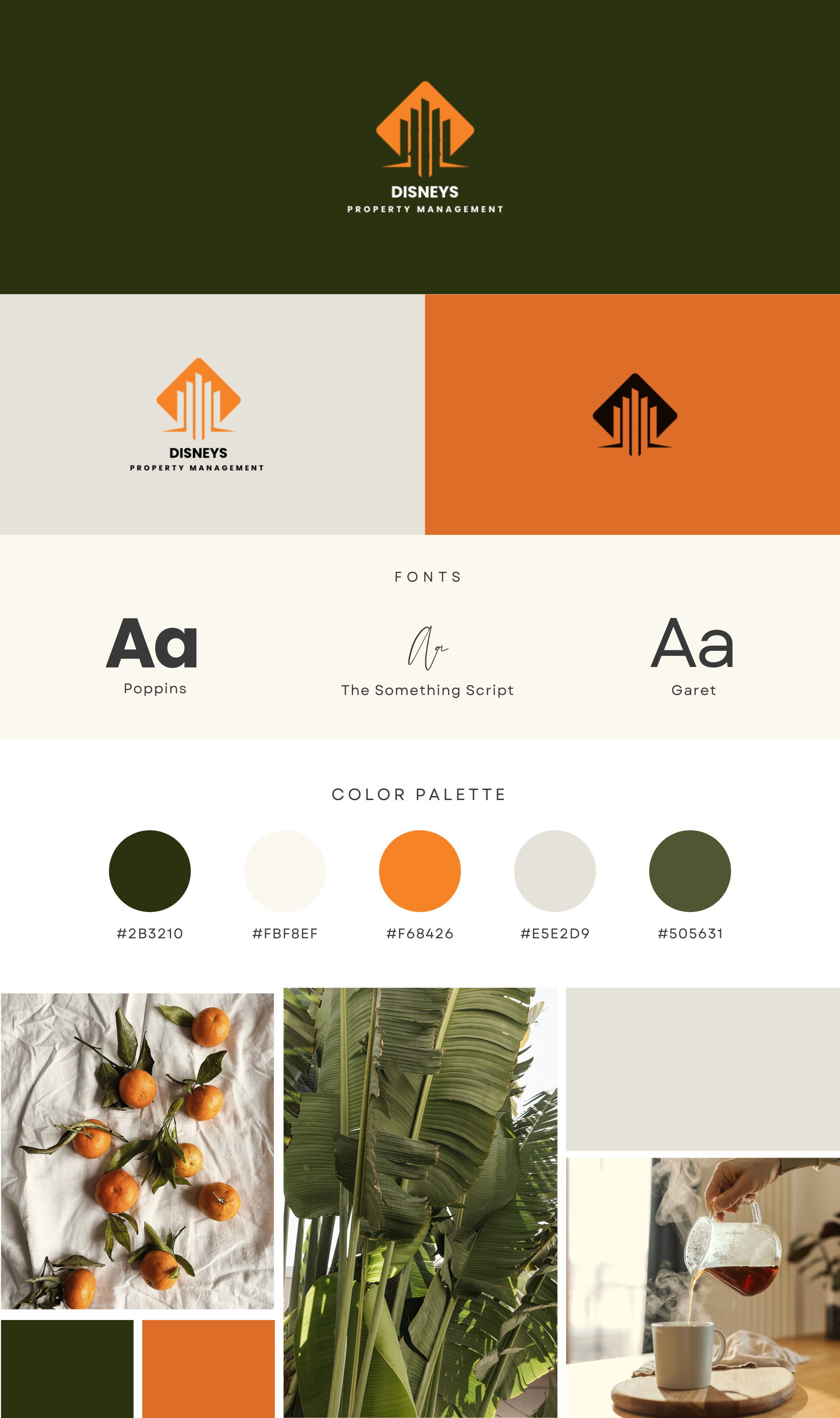
Logo, color palette, typography system, and brand style guide for a Metro Detroit property management company. Built to be professional, recognizable, and built to last.
The Brief
Disney's Property Management needed a brand identity that communicated trust, professionalism, and local credibility — the kind of look that wins jobs before a word is spoken. The logo needed to work on a truck wrap, a business card, and a website header equally well.
What We Delivered
Two full concepts with revision rounds. Delivered in PNG, SVG, and PDF. Light and dark versions included.
Primary orange, forest green, and neutral tones — with hex codes, RGB values, and usage guidelines for print and digital.
Heading and body font pairings — Poppins, The Something Script, and Garet — with size scales and weight usage.
Complete one-stop reference covering logo usage rules, color applications, typography hierarchy, and do/don't examples.
The Outcome
A clean, distinctive identity anchored by an orange diamond logo mark — immediately recognizable, versatile across formats, and built on a color system that holds up in every context. The full brand package is now running live across the website, Google Business Profile, and all marketing materials.
This is past work. CutLevel Studio now focuses exclusively on websites. See what we can build for your business at our pricing page.
Let's Get You Online.
Book a free 15-minute call. We will audit your current online presence and show you exactly what you are missing.
Book a Free Call